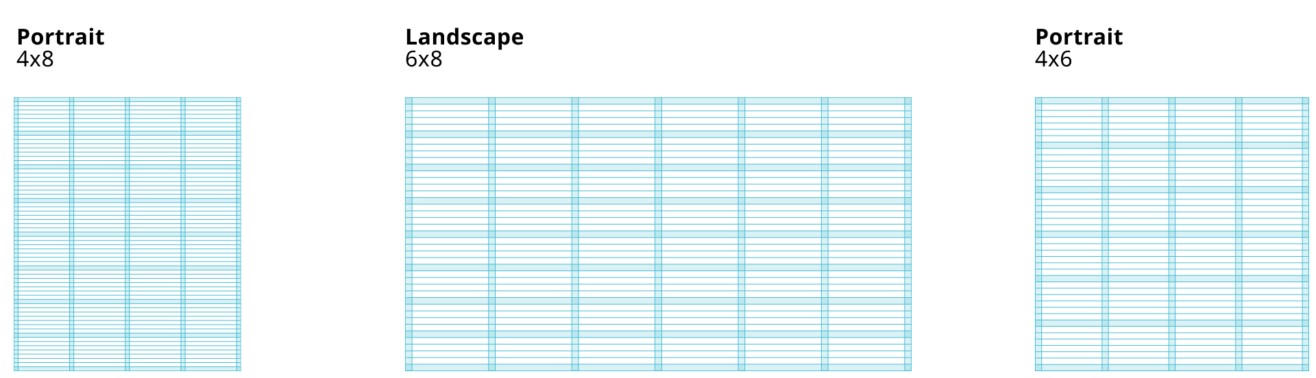
Grids & Layout
Grids are tools for organising space, text, images, and other visual elements in a design. Grids are used for adding structure to the design and assisting us in generating a standardised layout that helps people take part of the information that we’re communicating. The grid structure depends on the orientation and format and consists of 3 defined styles. Portrait will use 4x8, landscape 6x8 and a square format will use a 4x6 grid.

No set sizes
The grid is designed to be stretched and compressed and the exact sizes of cells, columns and rows are not defined. This is because defining exact sizes will create scenarios where the grid stops being helpful and instead become an obstacle when designing. We will have templates for standard formats such as 4:3, 16:9 and the A-formats.
In cases where non-conventional formats are used, try to apply these rules if possible. Regarding margins a good rule of thumb is using 5% of either width or height. We want to have the same margins for all sides so go with the smallest number, i.e. if your artboard is portrait – use 5% of the width as margins for all sides. The 5% margin number should be altered depending on size and application of the product.
Layout
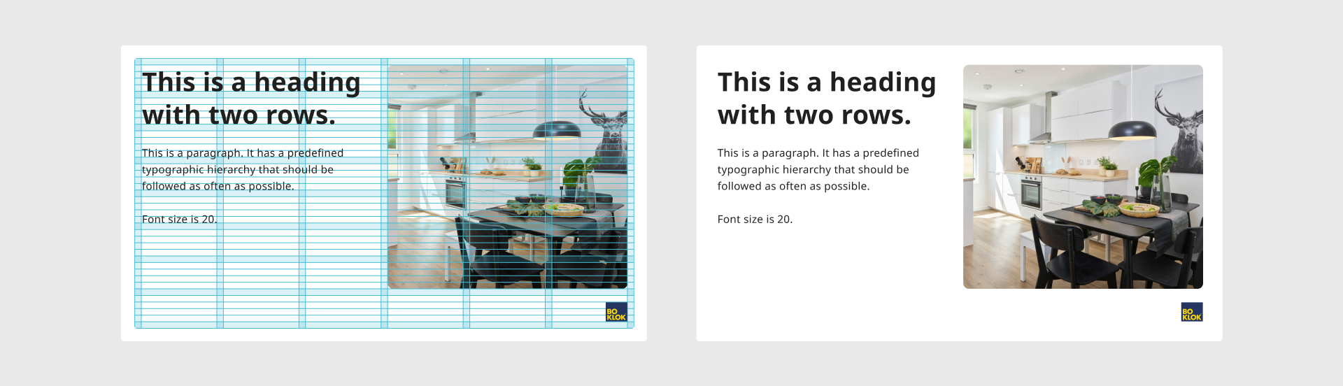
The layout should be structured with the help of the grid, but feel free to play with placement of visual assets and text within the grid. Make sure that your text boxes are of correct length for best practise readability, if a text box is using multiple or all columns the font size should be sized accordingly.
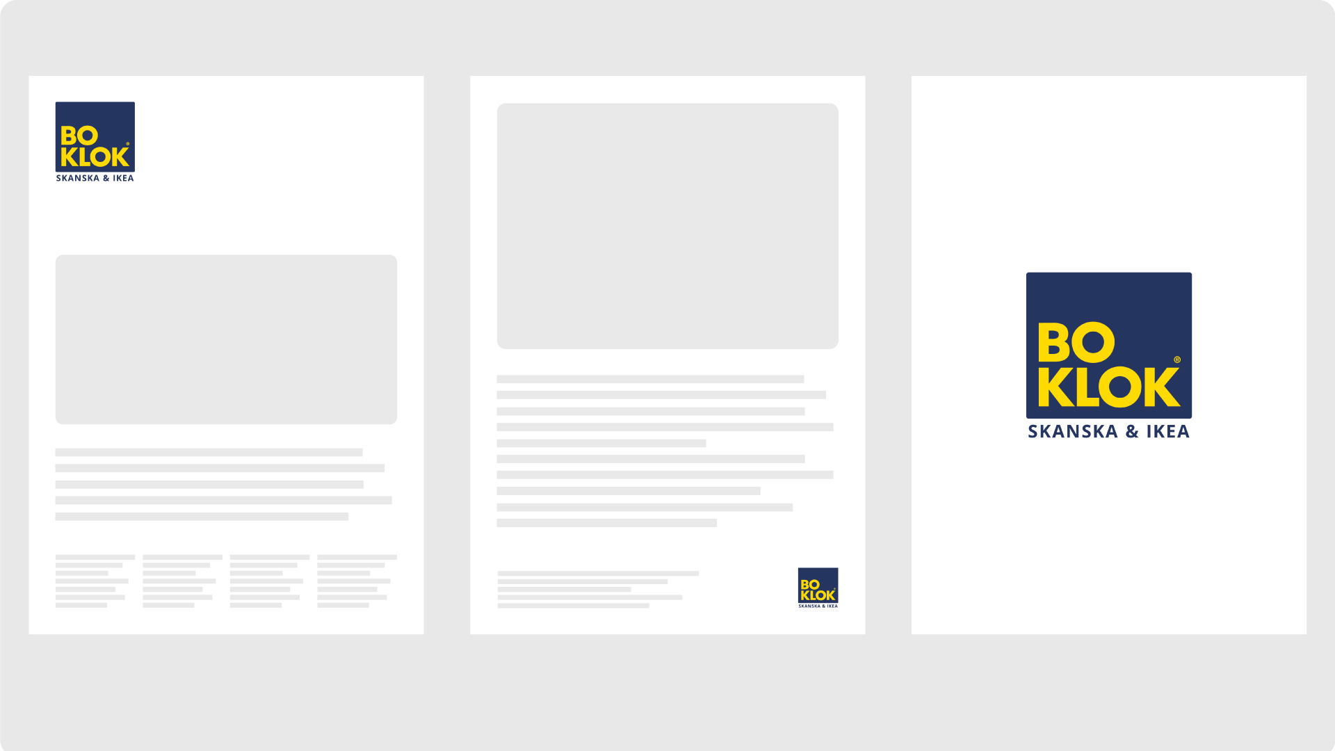
Logotype placement
The primary positioning of the logo will be the top left corner. This will be used as a standard throughout all communication. Sizing of the logo should depend on the scenario but as often as it’s suitable be in line with column width.
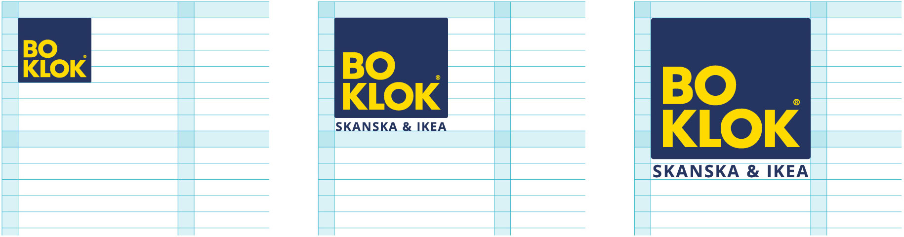
Sizing
Examples of sizing on grid.
Exceptions
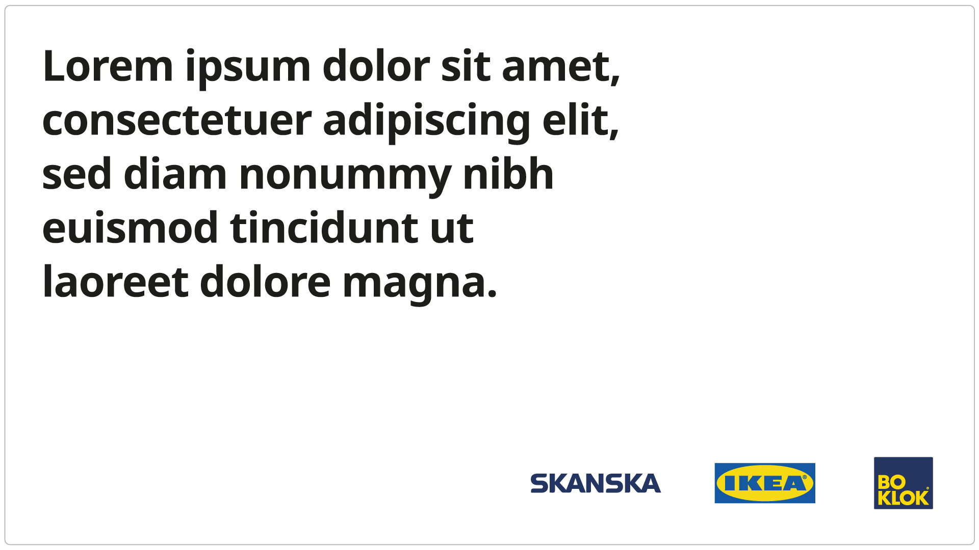
Exceptions of placement and sizing of the logo can be made when it’s a co-branded design. It can also be made when it’s established who the sender is, for example in a presentation. Exceptions can and should also be made when the logo is the main element of the layout.
Contextualised logo placement
1. First meeting
Top left is our preferred placement when communication with the recipient is not expected. Examples are marketing material. Top left is also our standard placement.
2. "Page 2"
Example of placement when the sender is established.
3. Take over / sign off
This placement can be used when the logo is the main element. Examples are as an intro in a video or as slide 1 in a presentation.
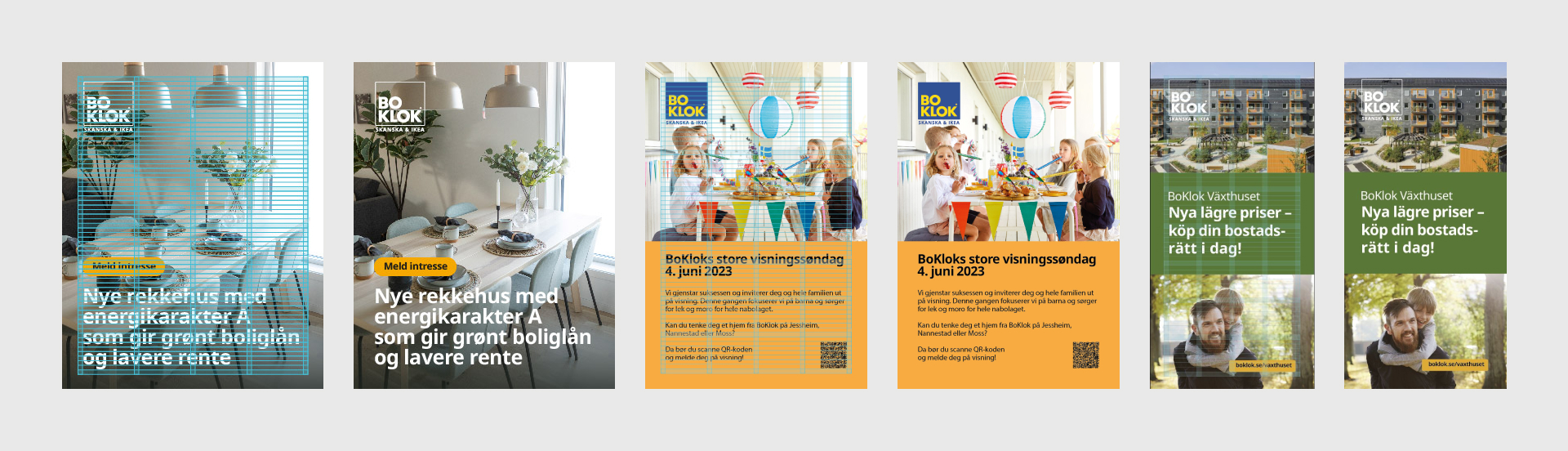
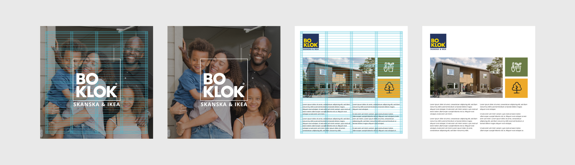
Portrait layout 4x8
The portrait layout can be utilized in a few different ways – here are a few examples. For the logo we have different sizes depending on the situation and the specific need. The two examples to the left are outside marketing and are often seen from afar. That means we have to adjust our layout accordingly, the adjustments being a big logo and short phrasing.
The example to the right are much smaller which means we have the oportunity to fit more content on the page.
See Typography for choosing the correct font size for your design.
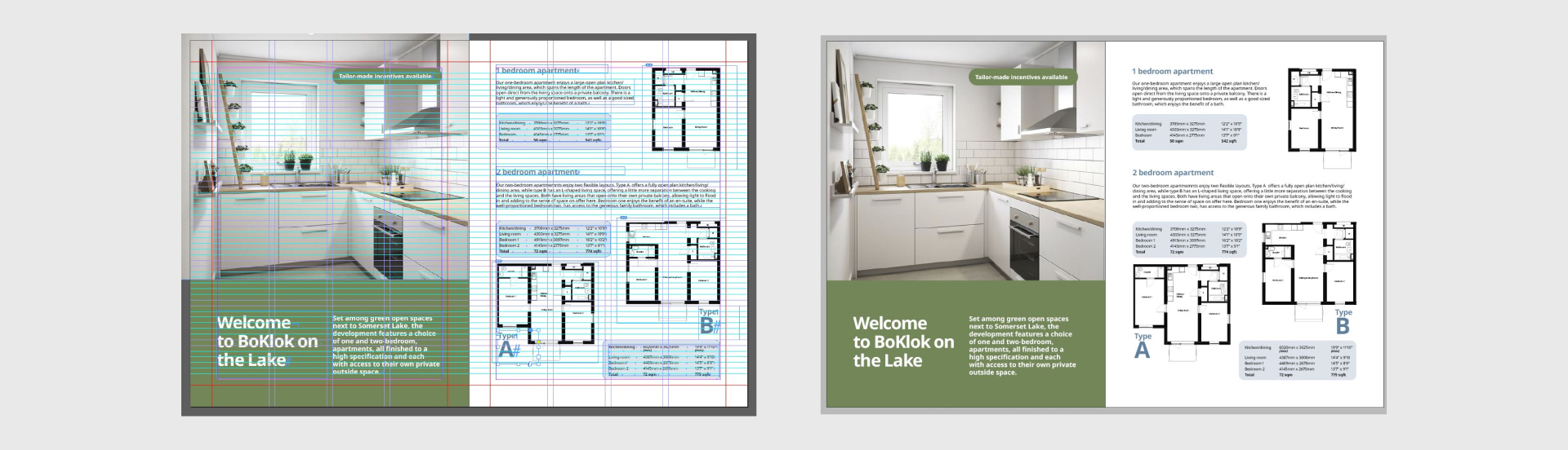
Spread
When working with spreads for a folder or a brochure, view the pages as single artboards and use the portrait version of the grid, not the landscape orientation .
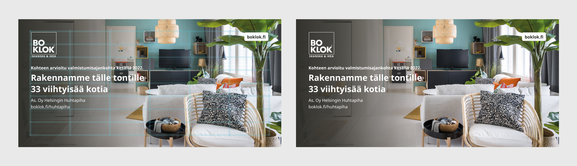
Landscape 6x8
These are two different formats of the landscape grid layout, the top one is from our Powerpoint template and bottom one is a backdrop. These are examples of how the grid could be stretched to suit a specific format and still contain a structured look and brand consistency.
Square 4x6 (approx. 1:1)
When a landscape or a portrait format is no longer indistinguishable from each other the square grid layout can be used. The other grids can also be used depending on how the layout will be perceived. If it’s a small screen square grid shall be used but if it’s a large square format such as a backdrop, one of the other grids can be used.
Friendly rectangles
- Inviting & friendly
- Warmth & trust
- Playful & happy
We have since young age been trained to trust the rounded rectangle. It is even in adulthood conveyed as a safer and more friendly element than the sharper, edgy version. As this plays very well with the ideas we want BoKlok to be associated with be sure to use this concept where you seem fit.
Standard radius on web
Small: 8 px
Large: 24 px
We follow our standard variables which are divided by 8. Border radius does more often than not visualise a clickable object on our sites.
Standard radius in print
Small: 4 mm (For images and others assets on an A4 format)
Large: > 4 mm (Scaled to visually align with other material)
The border radius for print should not mainly depent on static numbers but should be sized depending on size.
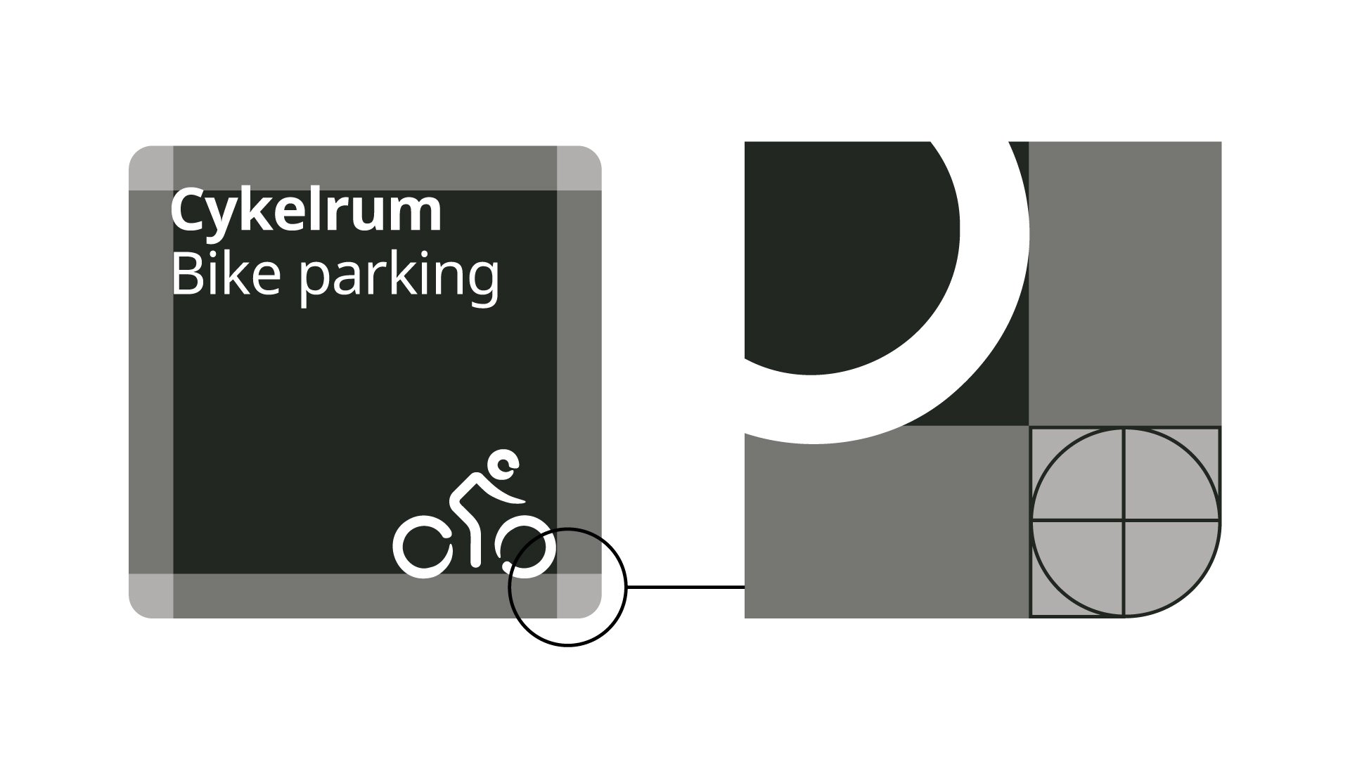
Here's an example of how the border radius is set on a 300x300 mm sign.