Logo
The BoKlok logotype is composed of a boxed wordmark. Our logotype is a very important asset in regards to branding. It must always be handled with care to ensure a consistent and trustworthy appearance.

Byline or not? (KLOKA HEM FÖR LIVET)
Logo with byline should not be rendered smaller than 110 px width when used digitally. If the size is smaller than this, use logotype without byline. For print the byline can be used down to the general minimum size (24 mm).
Total minimum size (width)
Print 24 mm
Digital 48 px
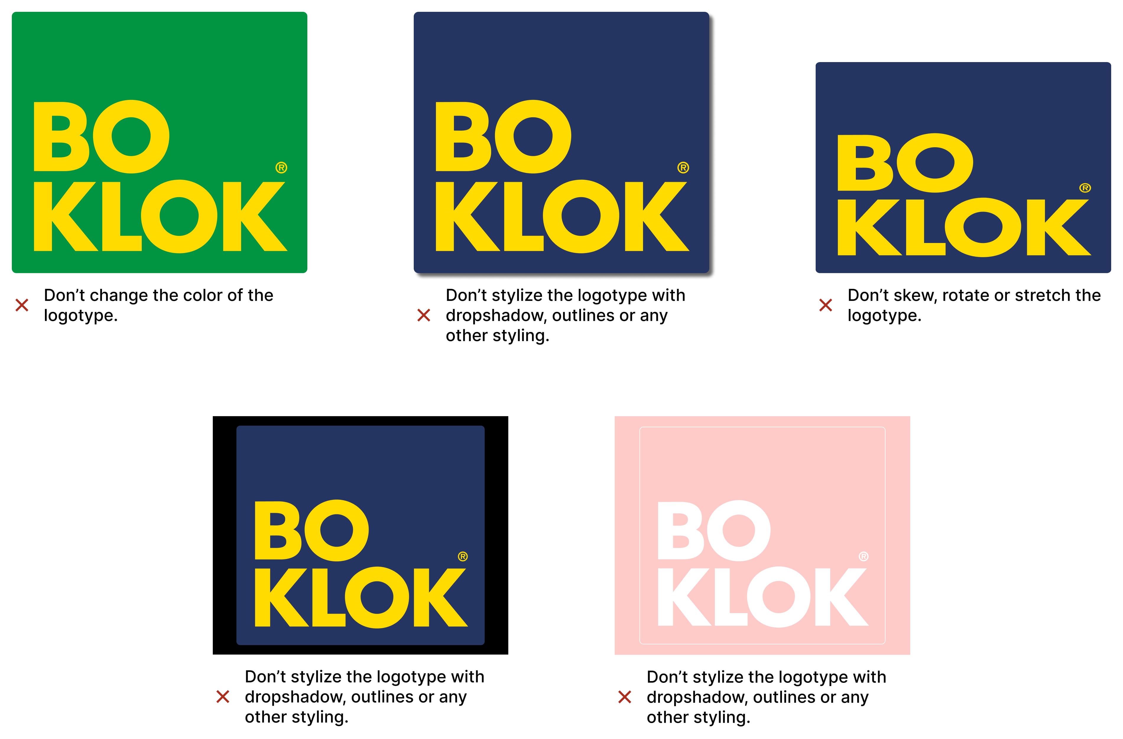
Do not tamper
The BoKlok logo shall never be manipulated in any way other than scaling. When scaling the logo make sure that the logo is not smaller than provided limitations and if applicable, make sure that it’s sized according to layout regulations.
See Grid & layout for more information.
Clear space
In order to preserve the integrity of the primary logotype, it’s important that no other logos, type or other graphic elements infringe on its space.
The minimum clear space around the logotype is equivalent to the size of the total logo width divided by 3.

Logo variations and how to use them
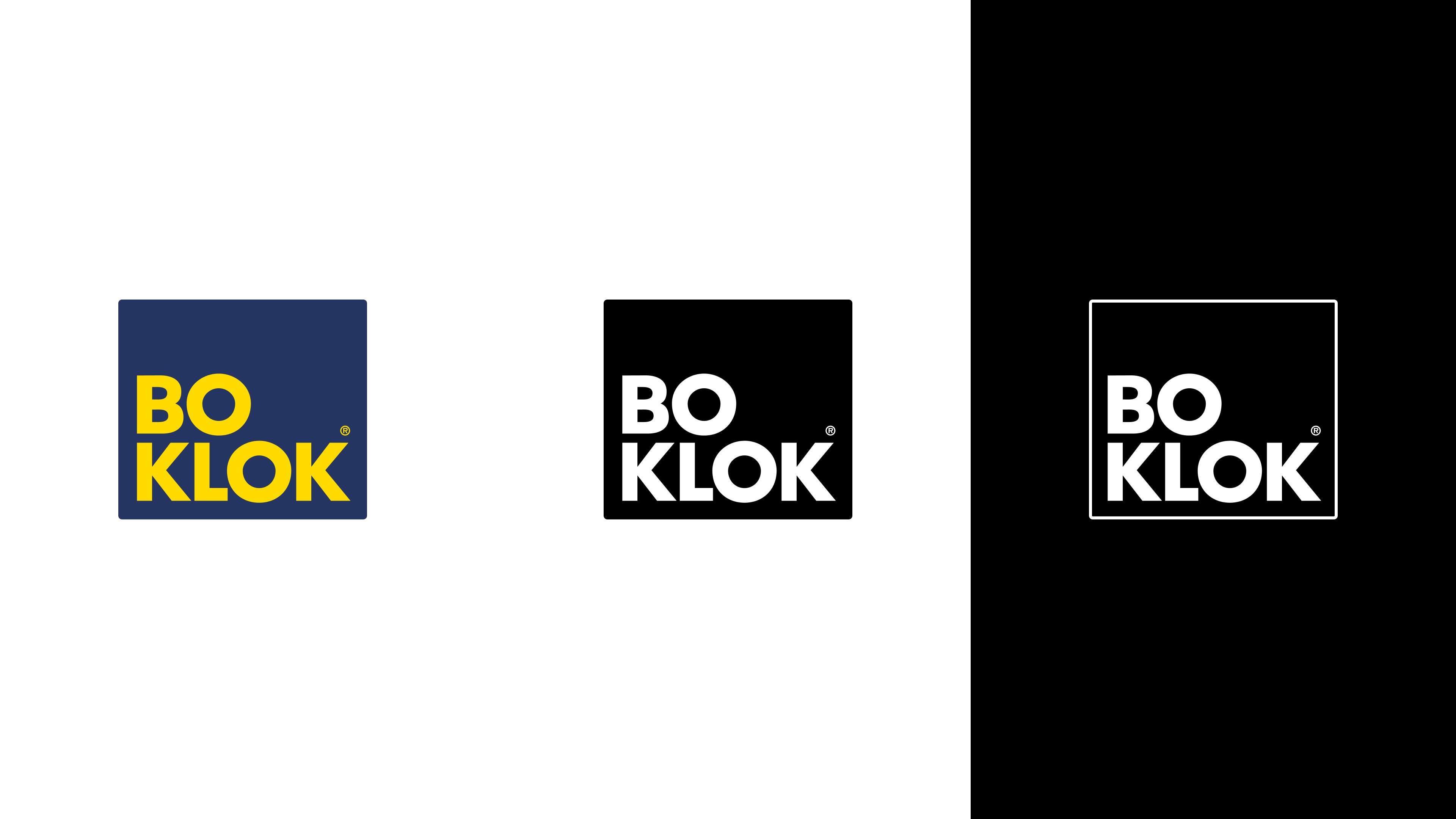
The primary blue and yellow logo should be used as often as possible. When color can’t be used, use the specified black and white version. Never render a monotone version of the color logo.
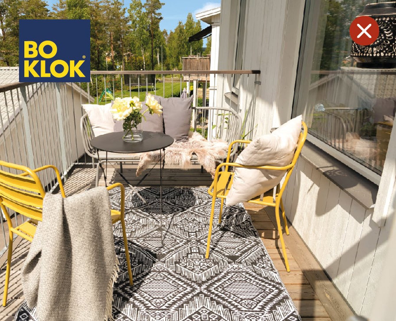
The logo can be placed on imagery, but avoid any busy areas of the image within the clear space area.
Advanced layout and placement are described later in the section “layout”
See examples for guidance. You can also view Grid & layout for more examples.

Logo on imagery
Do not put logo on busy image or busy area of an image.

Outlined logo
Do not use blue and yellow logo where it doesn´t stand out, instead use outline logo.

The outlined logo
The “Outlined” logo can be used as an alternative but should not be used excessively. It should preferably be used after the primary logo has been seen within the same media. It could be used as a sign-off at the end of a video clip or on the back of a folder. However, there are cases where the outlined logo should be used as the primary logo. For example: when the blue and yellow color doesn’t stand out as well as the white version does.

Logo on coloured background
These are guidelines for placing the logo on backgrounds containing our colours. We do this to ensure our logos legibility, so that it stands out against the background. If you are uncertian on how to work with contrast you can read more about it here or contact our Head of Communication in Sweden.
