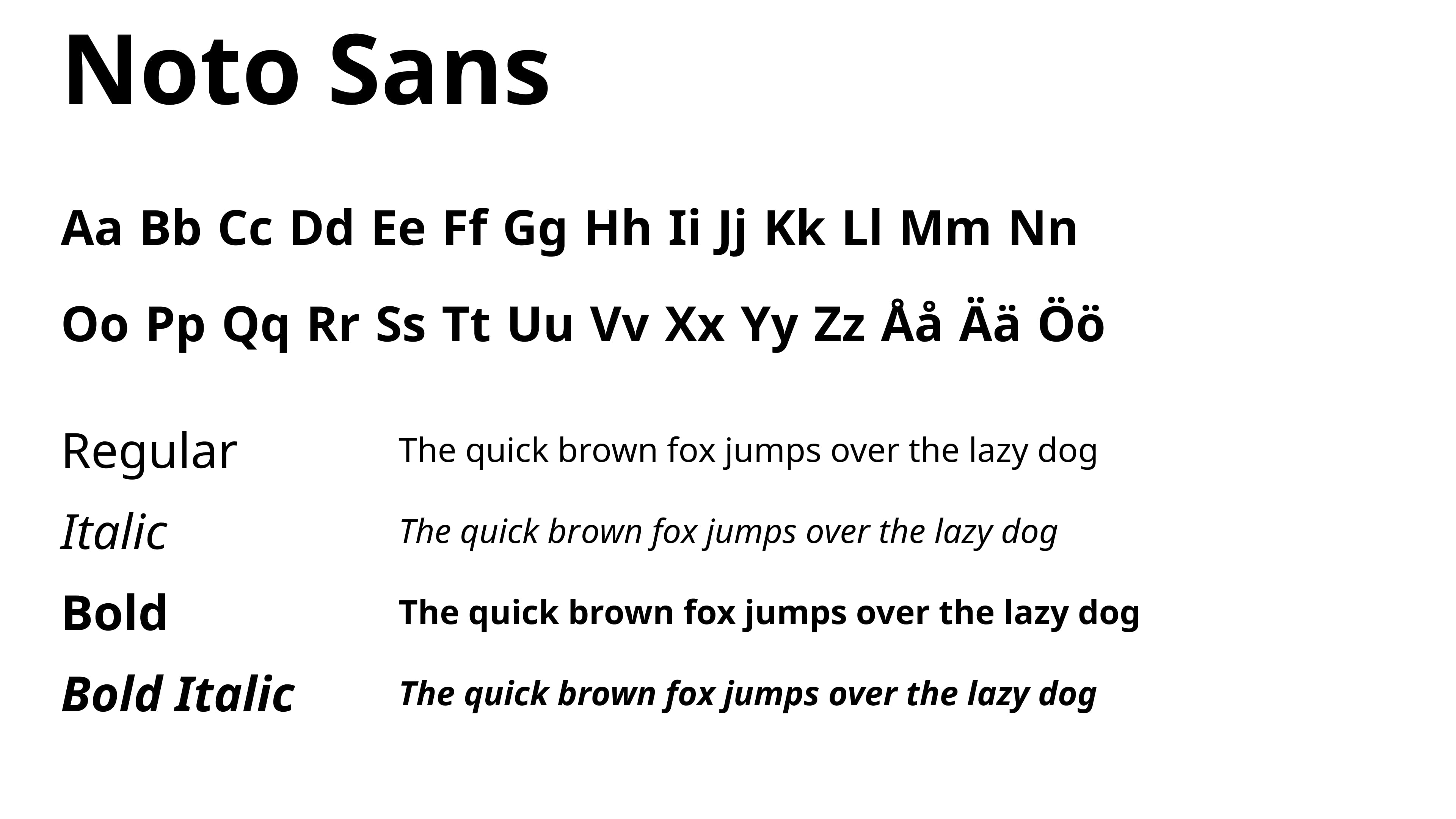
Typography
All type must be set in Noto Sans. Be sure to use correct casing, don't track too tightly or too widely. Tracking should primarily be used on headings. Tracking can vary per rendered font size to accommodate legibility. At minimum, heading tracking should be set to 0, if your title is extending beyond grid width, split the title into two lines.


Sizes
These are the sizes used on our website as well as other digital material. The size correlation should be used as guidelines for other media as well. For example an A4 format.
See Grid & Layout for more examples.
Size
64/78px. Use for headlines.
Heading (H1)
48/58px. Use for headlines.
Heading (H2)
36/49px. Use for headlines.
Heading (H3)
24/32px
Heading (H4)
16/26px
Heading (H5)
12/17px
Paragraph Large
20/36px
Paragraph
16/26px
Paragraph Small and details
14/22px
Fallback font – Verdana
The fallback font Verdana should be used in all cases where Noto Sans can’t be used due to technical limitations, for example in an email.

Web Content Accessibility Guidelines
We use a minimum of AA contrast rating when writing text. If you are uncertain about how to create legible content you can contact our Head of Communication or read more about WCAG guidelines.
Go to WCAG Guidelines